Saturday, July 21, 2012

Finally - a finished room (sort of)

We have been in our new house now for 3 years.  I always have grand ideas for how to decorate each room of the house but have this little issue with follow through.  Most of the time it has to do with not having the funds to really do a bang up job so why start, but mostly I just don't get my butt in gear and do it.  So after joking about it for a couple of years, I finally decided to knuckle down and finish up my oldest daughter's room.  She will be a senior next year and leaving for college after that and so it is now or never.
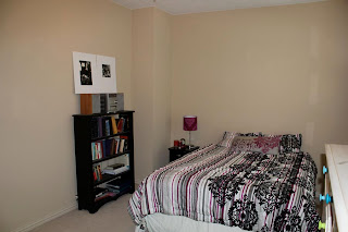
She and her sister were leaving for camp and would be gone for a week and I decided to surprise her with the finished project. After moving all of the junk and piled up clothes out of the way, I took a few "before" shots:


Pretty plain but functional

I was on a pretty tight budget and was able to get quite a few things within that number, but it's always the little extras that make it look complete that send you over that mark.  Once I got my husband in on helping me get some pieces together, he started making some suggestions.  Of course, I had to tell him that I had slightly exceeded the budget and he decided that I just needed to get what I could to make the room look finished.
I love that moment ;)

Here is the "finished" product.  There are still a few things here and there that I ran out of time to get done.  I'll get to them eventually.  My mom helped out with all the sewing because I am helpless at that stuff.  After this week I really appreciate those home improvement shows that put those people on a time limit.  I was stressing there at the end!


 I did this portrait of her awhile ago, but could never
decide what I wanted in the background.
I asked some of her friends to give me some
characteristics and scriptures that would fit her.
I got lots of responses and used those in the background.
 I found this chair for cheap at a little antique
store and just recovered it.  It's one of 
my favorite things in the room.
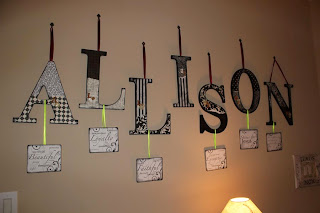
 I love the way this turned out.  
I put all of the characteristics that her friends sent me
on plaques that hang down from the letters.
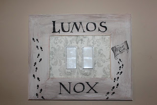
 This turned out well also.
It is hard to see in the picture, but there is a 
wire grid that all the earrings hang from.
We joked about doing this for a long time.
It was the last thing I added at the very last minute and 
it is her favorite thing in the room.

Above all, I wanted this room to be about who she is.  Her love for Christ, her passion for missions, her  role as a leader, her love of photography and how she is maturing into a beautiful young woman.  I hope I was able to capture that and show her how proud I am of her and who she is.  She is beautiful both on the outside and the inside.

Saturday, January 28, 2012

Winning Entries - Hopefully

Every year a local church/business holds an art competition exclusively for our city.  It is completely funded by donations from businesses in the area.  The unique thing about this competition is that the prizes are all in cash.  There are six categories and in EACH category there are 10 winners.
1st place is $5000 cash.

Our kids are always so excited about entering (duh).  The competition is very tough, but it is art, so it is subjective and based on what the judges like and therefore anything could win.  I have not always agreed with their final choices, but the majority of the time I am amazed at the winners.  To see past winners (and by the end of next week this year) go to www.cultureshapers.com and click on "go to visual arts  contest page".

Last year, I had one entry that made it in the top ten and he received 9th place and $250.  We were so excited for him.  This year all of the entries from our school are really impressive.  We find out tomorrow who made it in the top 10 and the placement determines how much money they will receive.  They all got my cell phone number yesterday and can't wait to text me if they made it or not.  Here are just a few of our entries for this year.  I didn't have the files for all of them to post.


This one is amazing!  She hand drew all of the creatures (they are in the shape of a hand) 
and then created watercolor paintings.  
She scanned them all in and added photos of rocks in the background.


This is one from a first year multimedia student.  
She was very nervous about her skill level coming into the year, 
but she knocked this one out of the park!


All of this one was hand drawn directly into PhotoShop using a pen tablet. 
 LOTS of hours went into this one to get all the shadowing and detailing.


Great use of PhotoShop effects and brushes!  
They started this one with a portrait studio session in Narnia
 (we call it that because it is a simple door down the hallway from our rooms, 
but when you open it, it leads into this massive cavernous air handling room).


This artist is in the school's "B-Boy" club.  In my day it was called breakdancing. 
 He got one of his friends to do some moves for him and added some really great effects.


I have to preface this one by saying that it is not in any way, shape, or form a demonic image. 
 The girl in the picture is one of my sweetest students 
and the boy who made the image is super nice and happy.  
He was just having some fun with paint.

Monday, January 9, 2012

The Art Teacher


I have been an art teacher for quite a while.  20 years to be exact.  I had collected quite a bit of art that I had done as examples for my classes in addition to my own stuff.  Some of them were starters and I never finished them, but several I took a liking to and saw them through to completion.  A couple of years ago our school went through a major renovation.  I, in my desire to leave quickly for the summer, did not pack away one of my most important collections - my own portfolio that dated back to my freshman year in high school.  When I returned it was no where to be found.  I have since moved on and tried to remake as much as I could, but there have been many times where I start the phrase "Let me show you an examp-......oh yeah, it doesn't exist any more"  Heavy sigh.....  Hangs head in shame.  So now I take photos of everything because you never know when it could go missing.  Here are some of the projects that I have attempted with my students over the years.

 The white still life is always good to start basic shading techniques with Art I. 
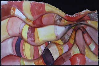
 One of my favorite mediums is watercolor.  
This is a glazing technique that is pretty easy to do for Art II students.
 I also love working with Prismacolors.  Especially on black paper.
 One of my most successful projects is Op Art.  It teaches color, value and space so well.
The students really love it and it is a pretty easy one for all to understand and be successful.


 This is fun to do with patterns on textured surfaces.
 Tempera Resist.  
 Watercolor practice techniques using warm or cool colors.

Thursday, December 29, 2011

Christmas Decorations (aka Pinterest obsessions)

So I have discovered Pinterest and the obsession/addiction that it has become.  There are so many things on there that I want to make, but like the rest of my life, I just don't have the time (or money).  I did manage to create a few things that I had pinned for Christmas decorations.

 I made this prePinterest.  The kids love it and it has become
a fight over who gets to be the last one to put up baby Jesus.
They actually have a 3 year rotation worked out and they ALWAYS remember
who's year it is.


 Each piece has a snap on the back and a pocket that it goes in.


 Pinterest project #1:  wreaths on the cabinets


 Pinterest #2:  Stacked presents at the door


 Pinterest #3:  Hanging ornaments from the chandelier


The table decorations were actually my idea.  I saw these gold 
covered cones at a store and refused to pay the price they wanted.
So I made my own and added red and gold ornaments to match the chandelier.

Wednesday, December 28, 2011

Elements and Principles

As a Photo and Art teacher, I am always trying to get my students to pay attention to the Elements of Art and the Principles of Design.  Things like: line, value, texture, shape, form, color, repetition, unity, balance, rhythm, etc.....  Since I try to emphasize these things in class, they have a tendency to dominate a lot of my own images.


Kid pics

I wouldn't consider myself a portrait photographer, but I do like to take pictures of kids doing what they do best - exploring and being carefree.  I have never set up a "photo shoot" nor would I ever want to.  I get happy accidents most of the time and then, like most great photographers, I PhotoShop the heck out of them!!